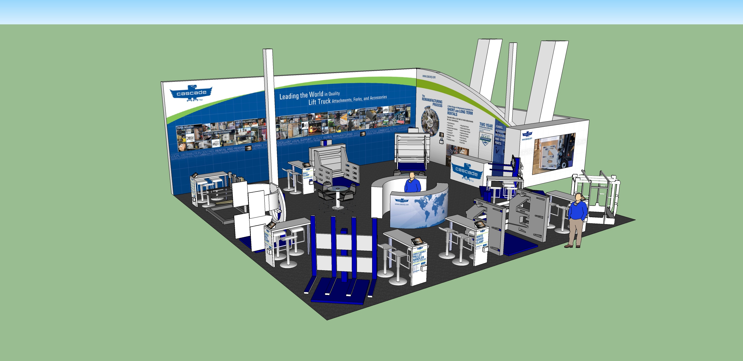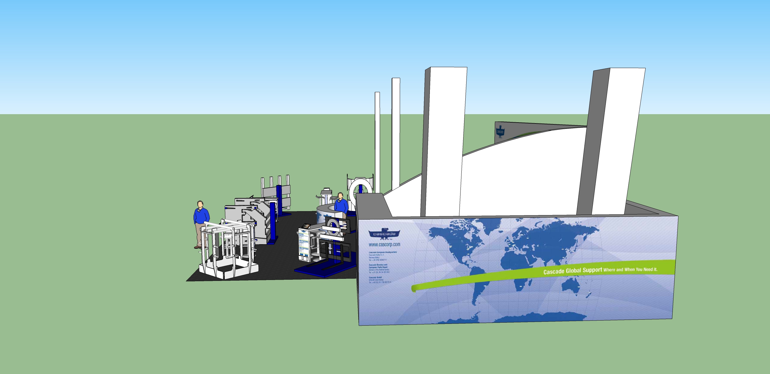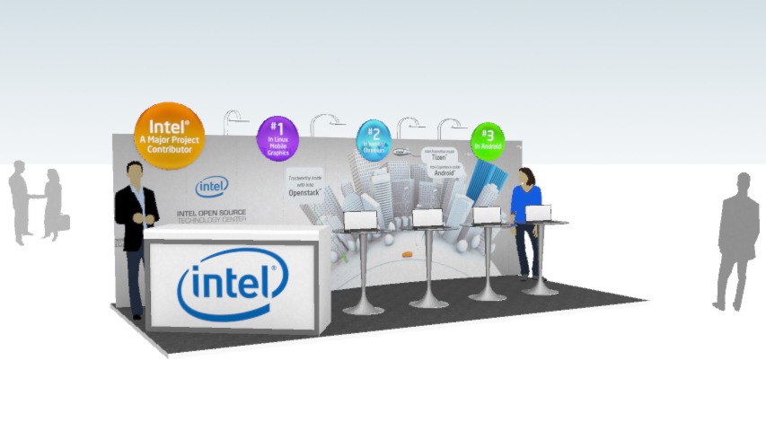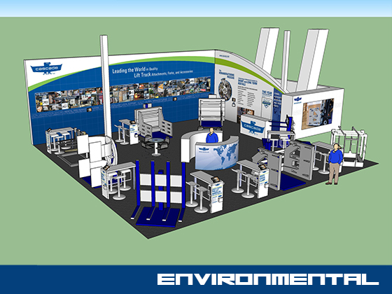
I was contracted by Cascade Corporation to design the trade show booth backdrop graphics and booth layout for the CeMat Trade Show in Germany. I was responsible for the layout of the booth which included the design of the vertical space as well. The booth needed to fit several large pieces of equipment that are part of the Cascade Corporation product line. The booth also included several groupings of furniture for sales staff to meet with customers.
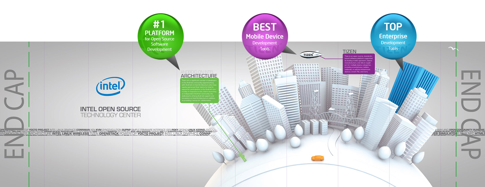
The graphics needed to showcase the vast array of products Cascade Corporation sells. The shape of the large backdrop was designed to be unique with an arch mirroring many of the identity elements from Cascade’s marketing materials. The backdrop was designed to rise high above the other booths nearby. It needed to be seen from the other side of the convention hall.
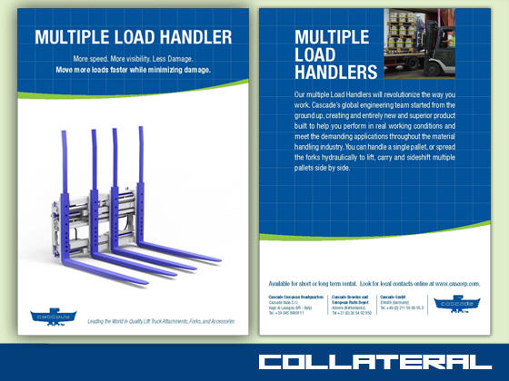
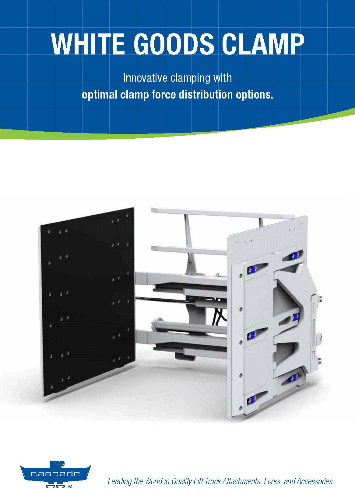
I was responsible for the graphic design, environmental 3D modeling in Sketchup, and management of all the print services. Along with the booth backdrop, I was responsible for all the marketing material handed out at the trade show.
The booth and all the accompanying 3D elements was a great success. They improved client conversion during the Trade Show as well as increased traffic from previous years.